Jercy Dee
Project Navigation
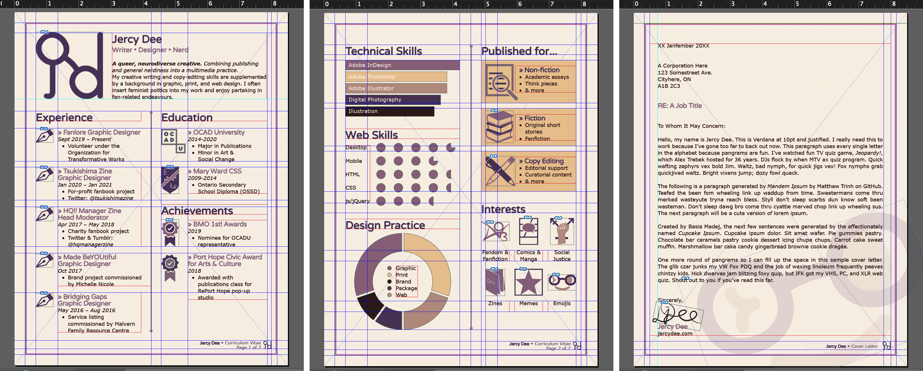
Jercy Dee: Brand, 2020-2021 Logo Conception Typefaces Colour Palette Additional Graphic Elements Related ProjectsJercy Dee: Brand, 2020-2021
Brand and Logo Design • Personal Project
Created with Illustrator, Photoshop, and InDesign
- Revised logo
- Revised style guide including typefaces, colour palette, texture, graphic elements, grids and guides, etc
A complete revision of my brand, which was first conceptualized in 2015. Done because I was dissatisfied with the original aesthetic and layout design. I also wanted to create a more rigorous style guide for myself.
Logo Conception
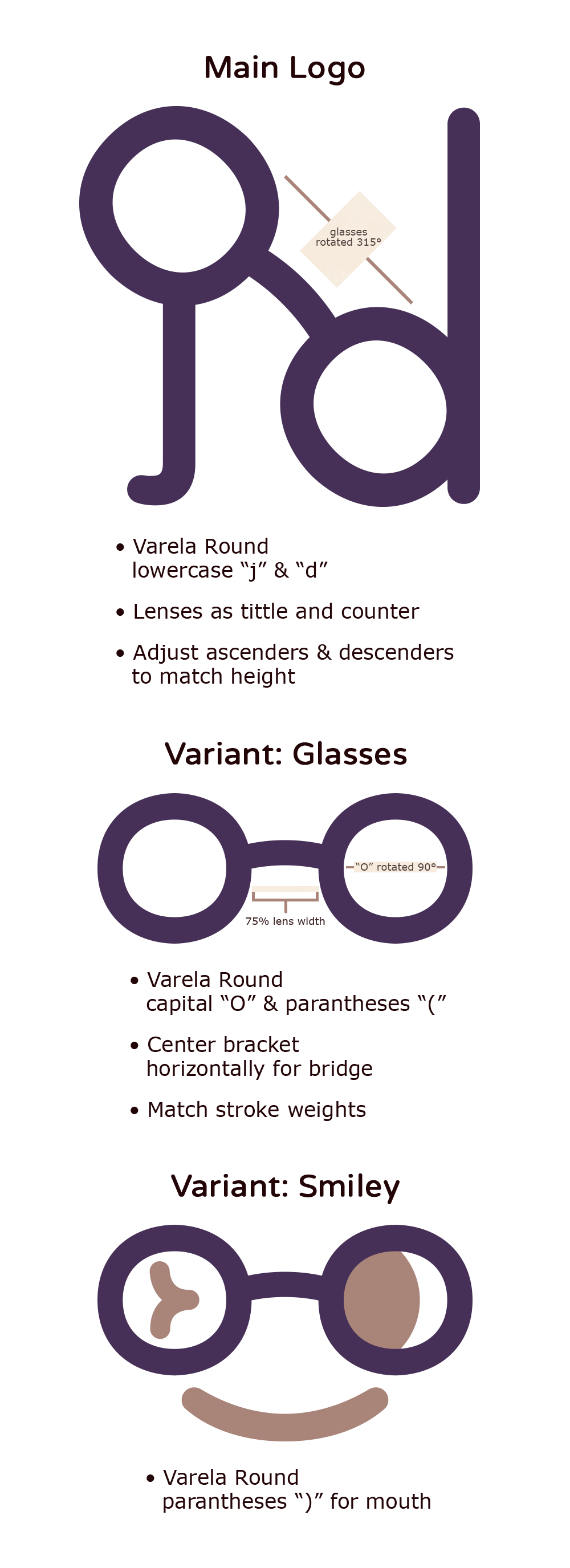
The logo is still based on my initials and eyeglasses. I always wear glasses with circular lenses and wanted to continue using this as the base for my current logo. The smiley variant I especially created because I like to use smileys, emoticons, and emojis whenever appropriate (> ◡ ◕)
Typefaces
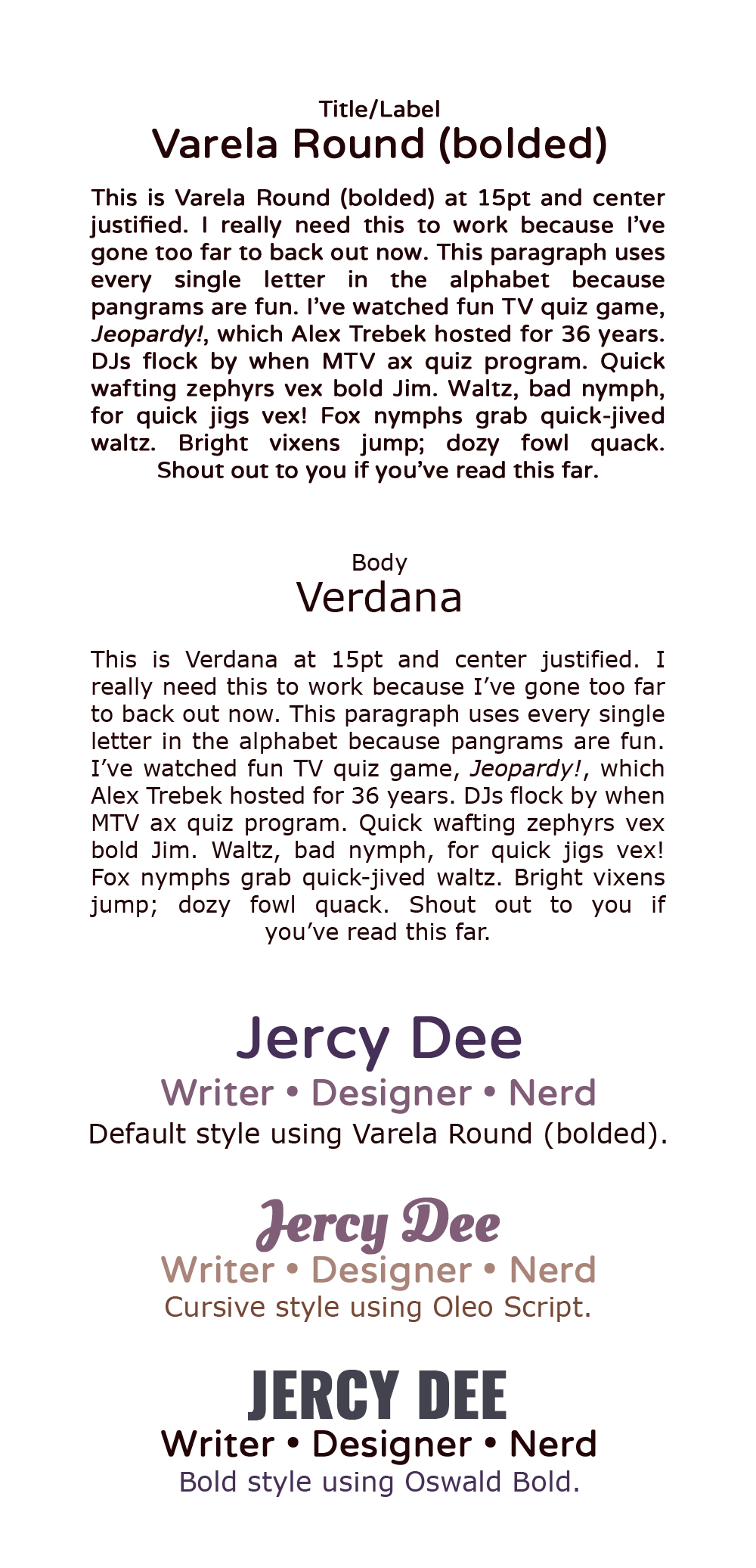
In addition to ensuring that all typefaces were compatible across browsers and devices, I wanted to use sans-serif typefaces to keep the brand consistent and contemporary.
Colour Palette
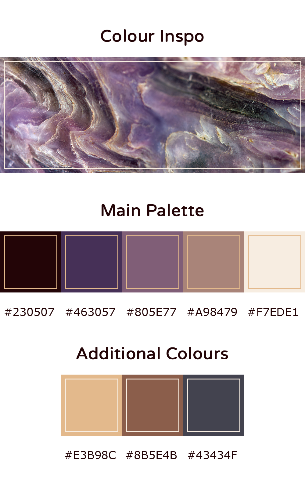
The palette includes many of my favourite colours and uses different hues of purple, brown, and yellow.
It was initially inspired by a palette from Color Palettes. I sourced the image to a photograph on Shutterstock, chose a new photo from the source for the base, then adjusted the colours from there.
Additional Graphic Elements
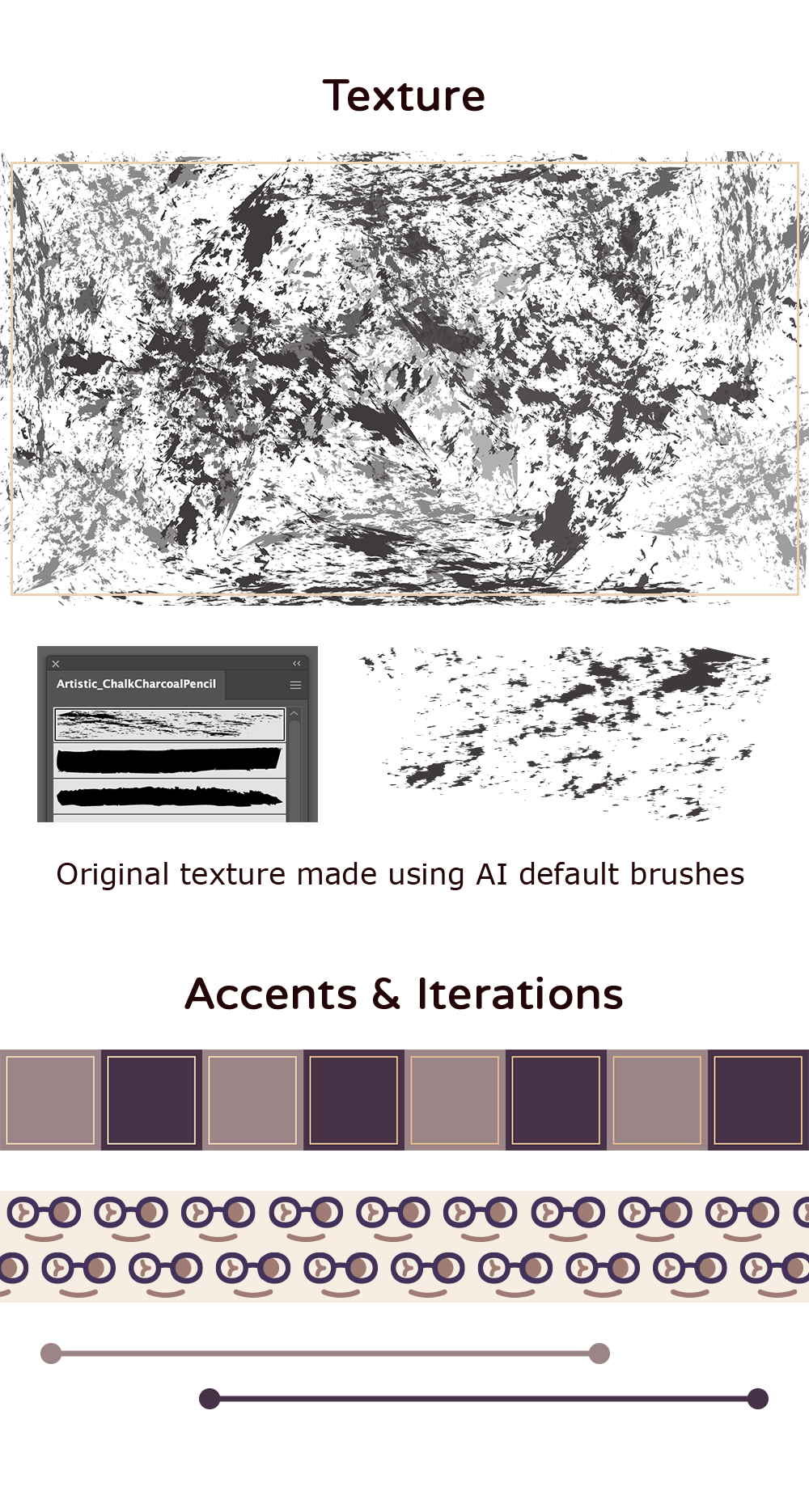
I like playing with textures and patterns, so I wanted to reflect that in my brand too. I also use a strict grid to format my brand across different media.
Related Projects
To see the revised brand applied onto different media—including my CV, website, and social media—check out Jercy Dee: Applied (2021).
For details about my work experience, see my About.
